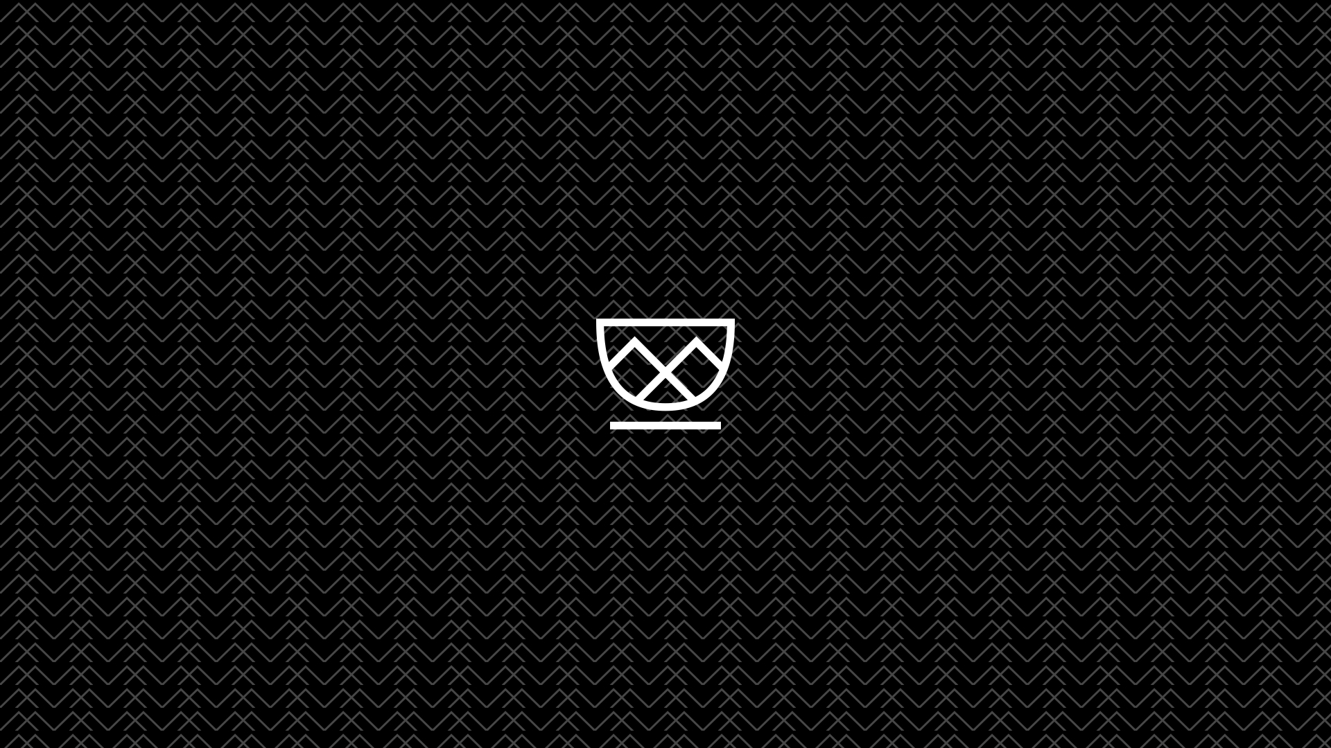
Logo and basic branding for Cafe ROCK
January 1, 2019Once in a while, you get to work on a smooth-sailing project. A project that is pleasant throughout. This was one such project. Me and the client had fluid communication from the get go and that helped me collect the right data to make a perfect logo.
1. Meeting, talking
The first meeting is crucial to the success of the project. It is where you vet each other, see if you’d work well together, set expectations, negotiate, sometimes part ways, sometimes shake hands.
The owner of the business was easy going. I immediately knew that he would be a pleasure to work with. He had some ideas, but didn’t force them. He really wanted someone professional to take care of the details.
The Detail
The project was designing a logo for a cafe located in Kasol, a beautiful hamlet in Parvati valley on the banks of river Parvati.
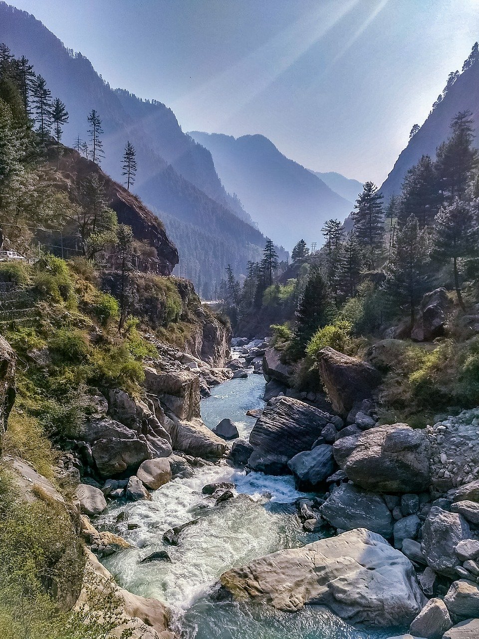
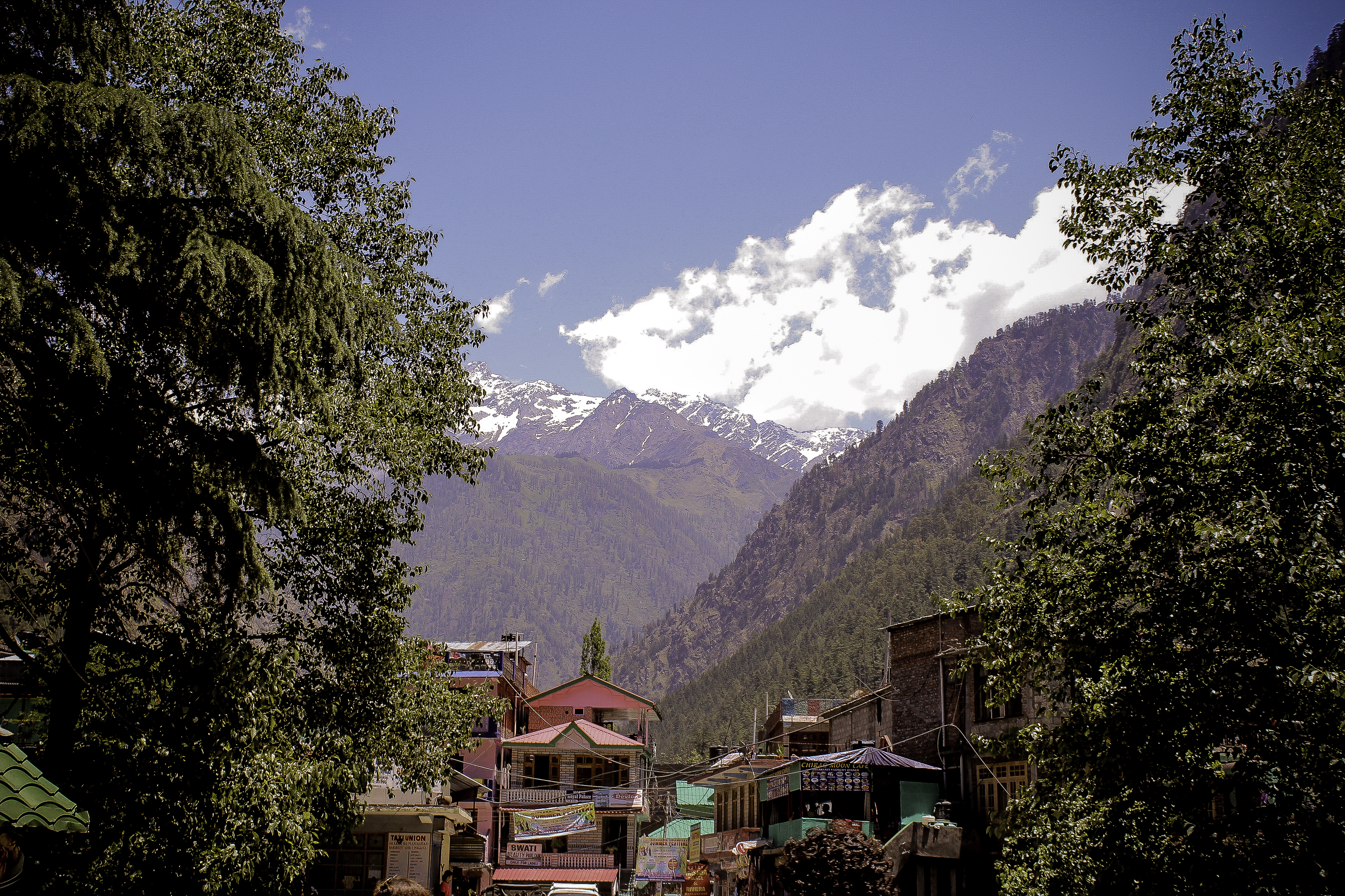
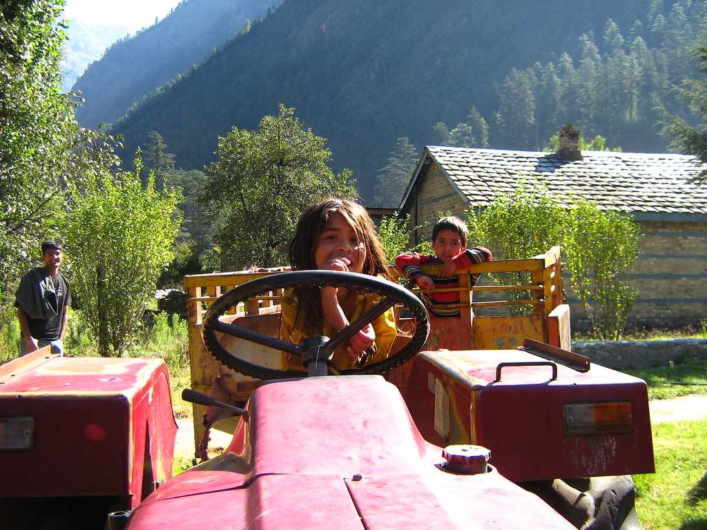
The cafe is named Cafe ROCK: Realm Of Coffee Kasol and is located at the end of a quiet road that led directly to the bank of river Parvati.
At the end of our meeting, I had enough information to get started on the project.
Attributes
- Classy (adjective)Having or reflecting high standards of personal behaviour
- Country (noun) A rural area
- Realm (noun) A royal domain; kingdom
2. Sketching
I start churning the take-aways from the meeting in my head. And then, start sketching - my favorite part of the project. Sketching makes me think. Thinking helps with exploration. I sketch a wide variety of ideas that have little in common - abstract and concrete.
Usually, I don’t prefer to reach my computer at this phase. Unless I find myself stuck and do image searches of the brand attributes to get inspired.
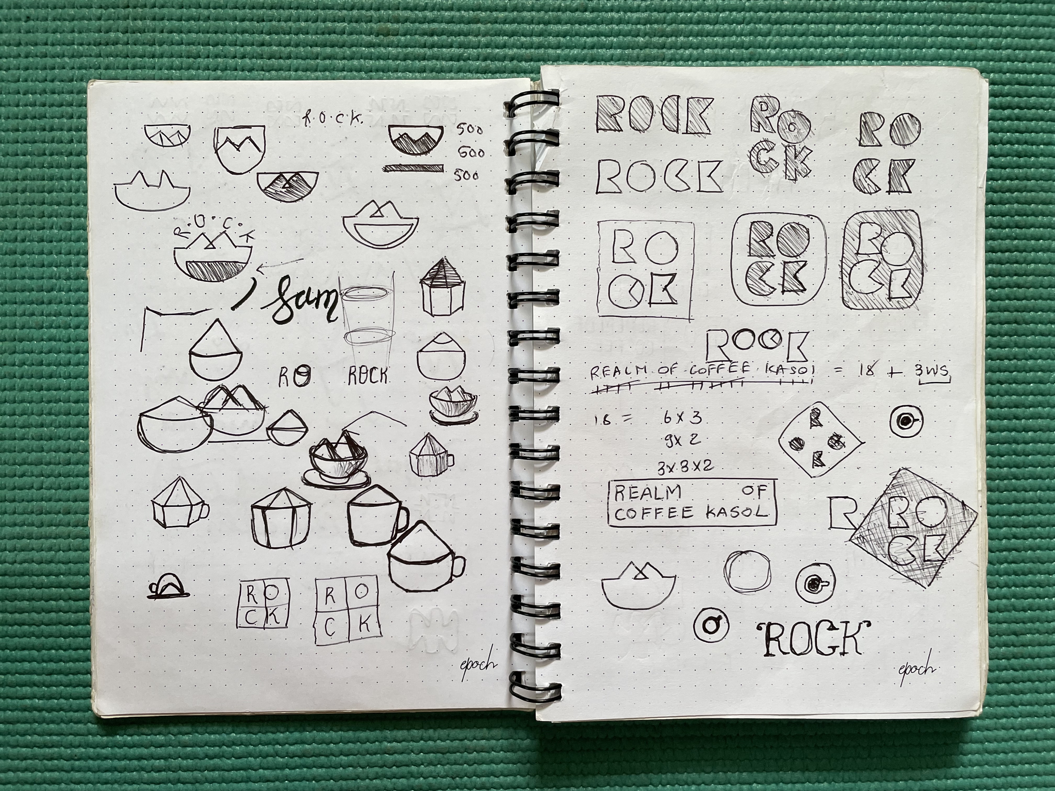
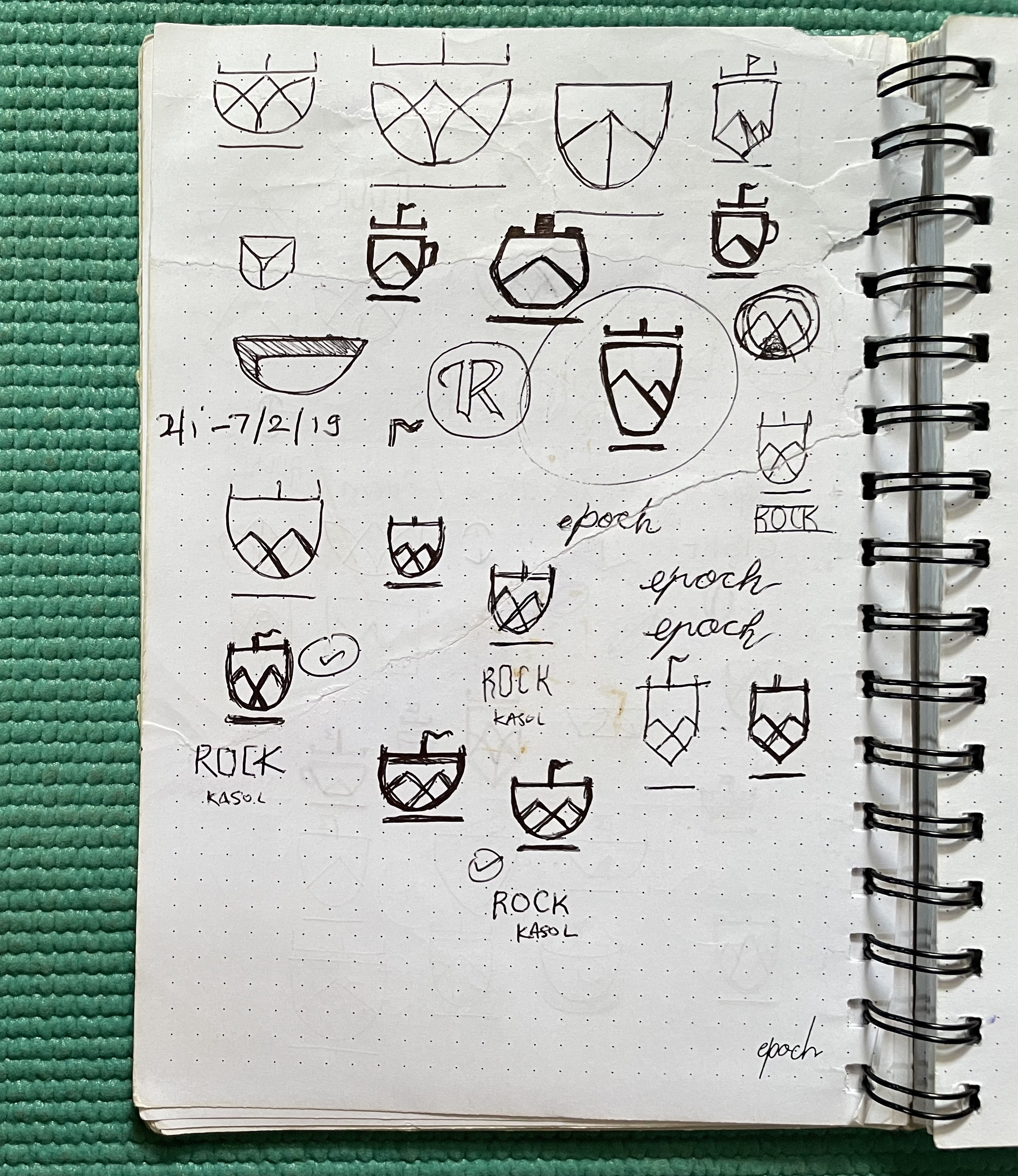
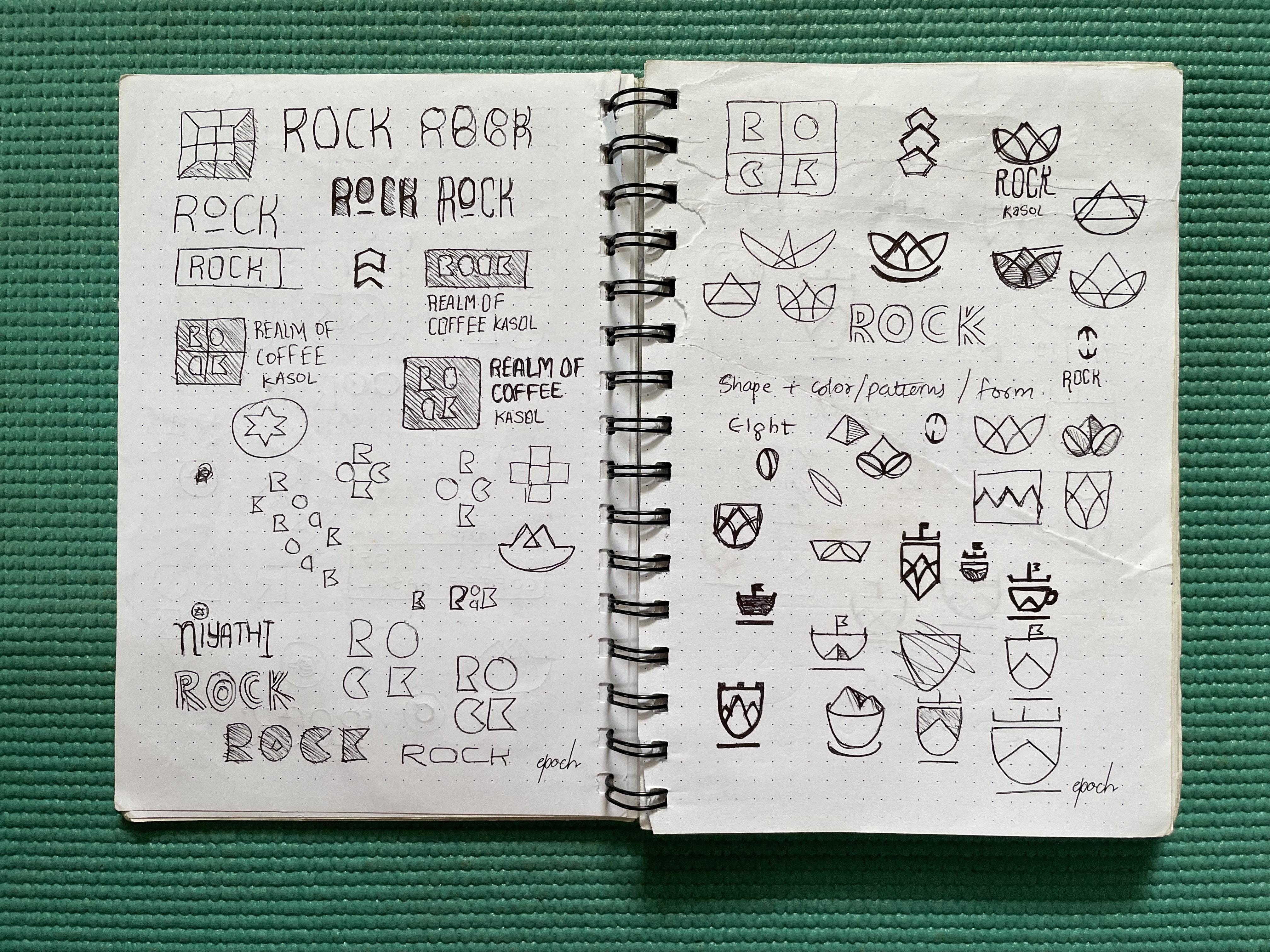
It’s like slow cooking of ideas. In a while, ideas start cooking and I can smell success. Then, I go all in in that particular direction.
3. Vectorization
Having a sketch of the final concept makes the vectorization trivial.
Sometimes, I strip down a few unnecessary details during this phase. For instance, I dropped the flag on top of the cup.
Back when I did this project, I used to use Illustrator for my vector work. These days however, I prefer Sketch or Affinity Designer.
4. Pattern
I couldn’t help but use the mountains I drew during the vectorization as a pattern. Not that it was intended, but the pattern ended up looking like waves of water. This fulfilled my wish to inculcate the river Parvati in the branding.
5. Colors
I don’t always prescribe a color palette for my logo projects. That’s the job for branding. For this project however, the client needed a palette to paint the cafe.
I won’t lie. My color picking process is basic. I just eye-ball the combinations. But the process isn’t an undisciplined one. I use the brand attributes I picked earlier as a guide.


I settled on a combination that looks really classy on display and on the interiors.
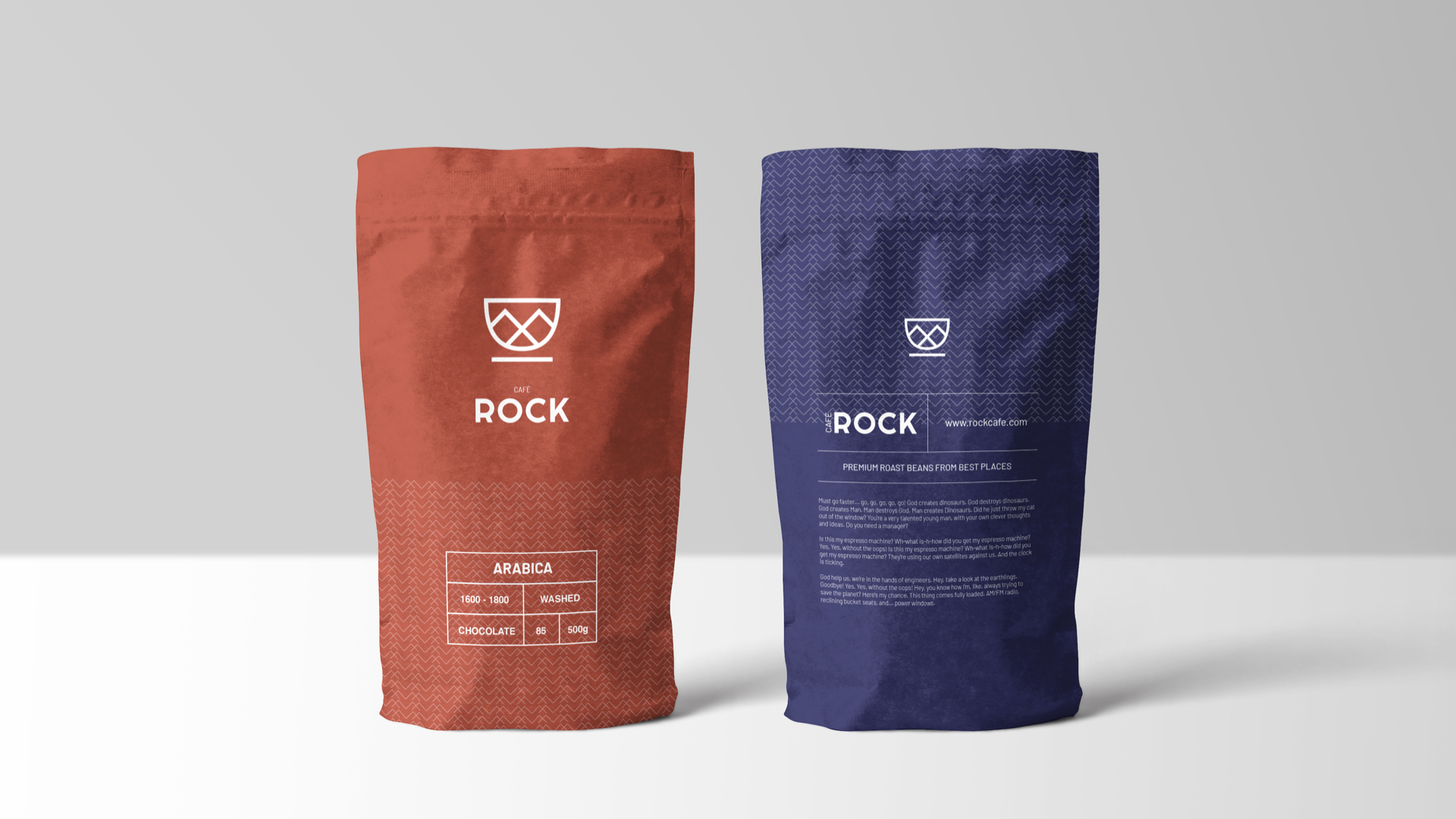
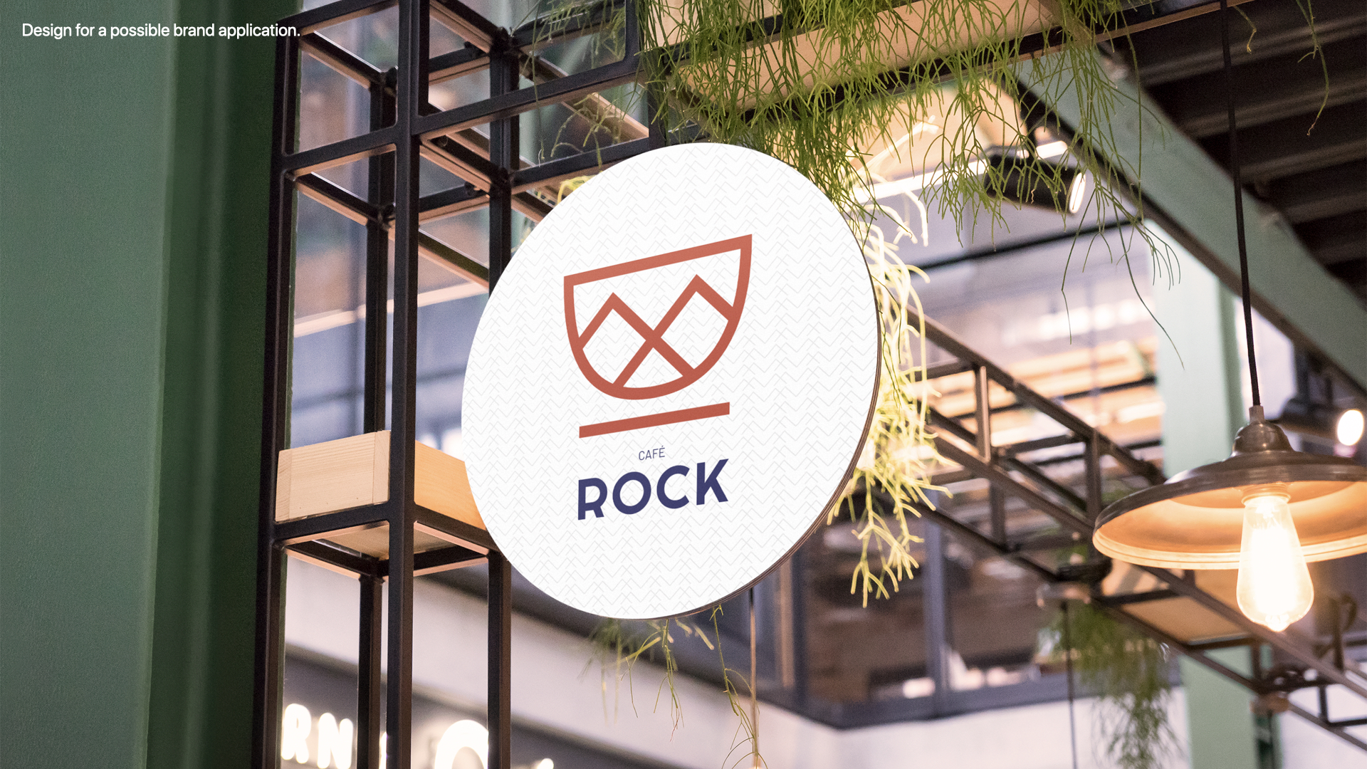
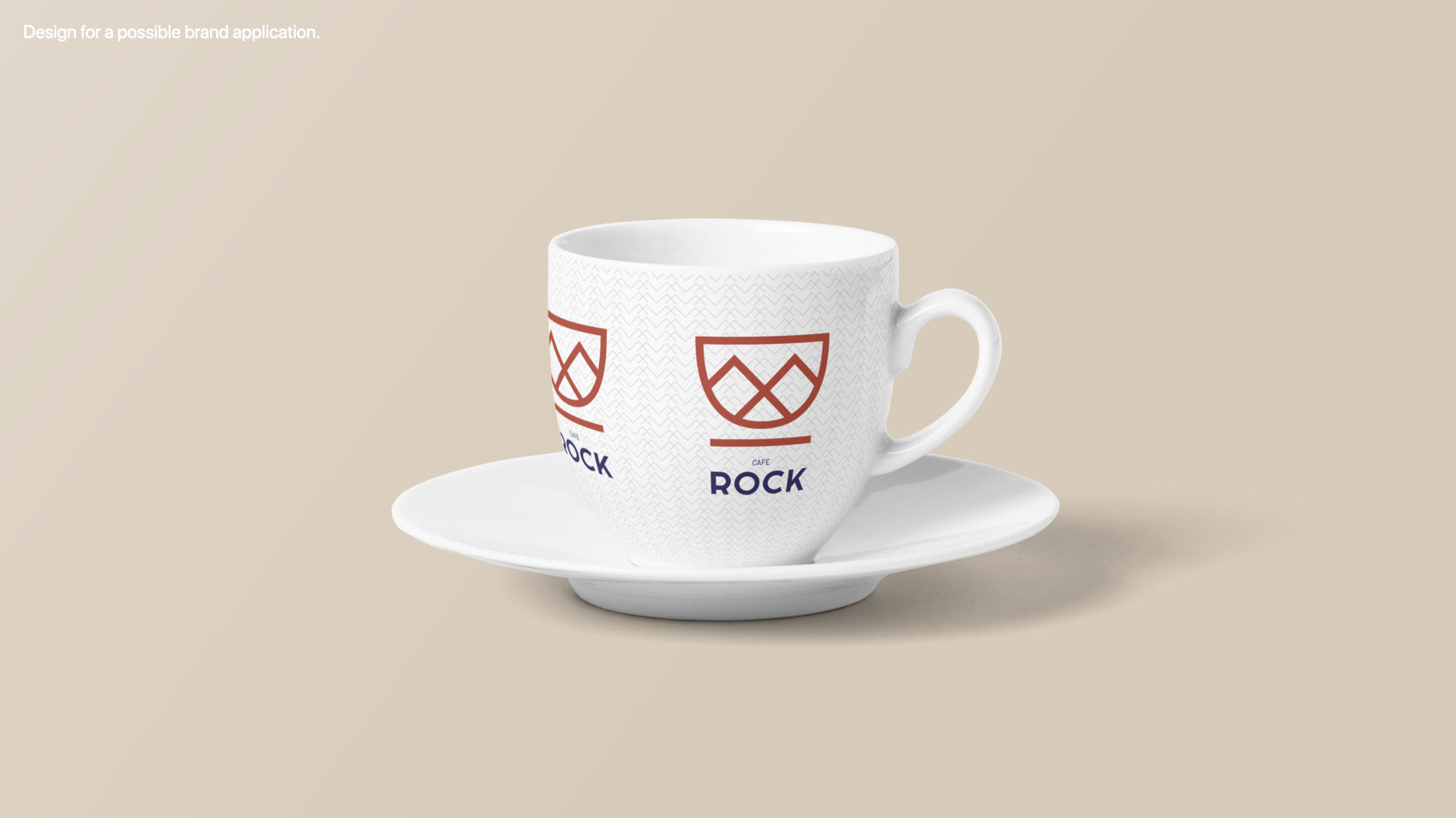
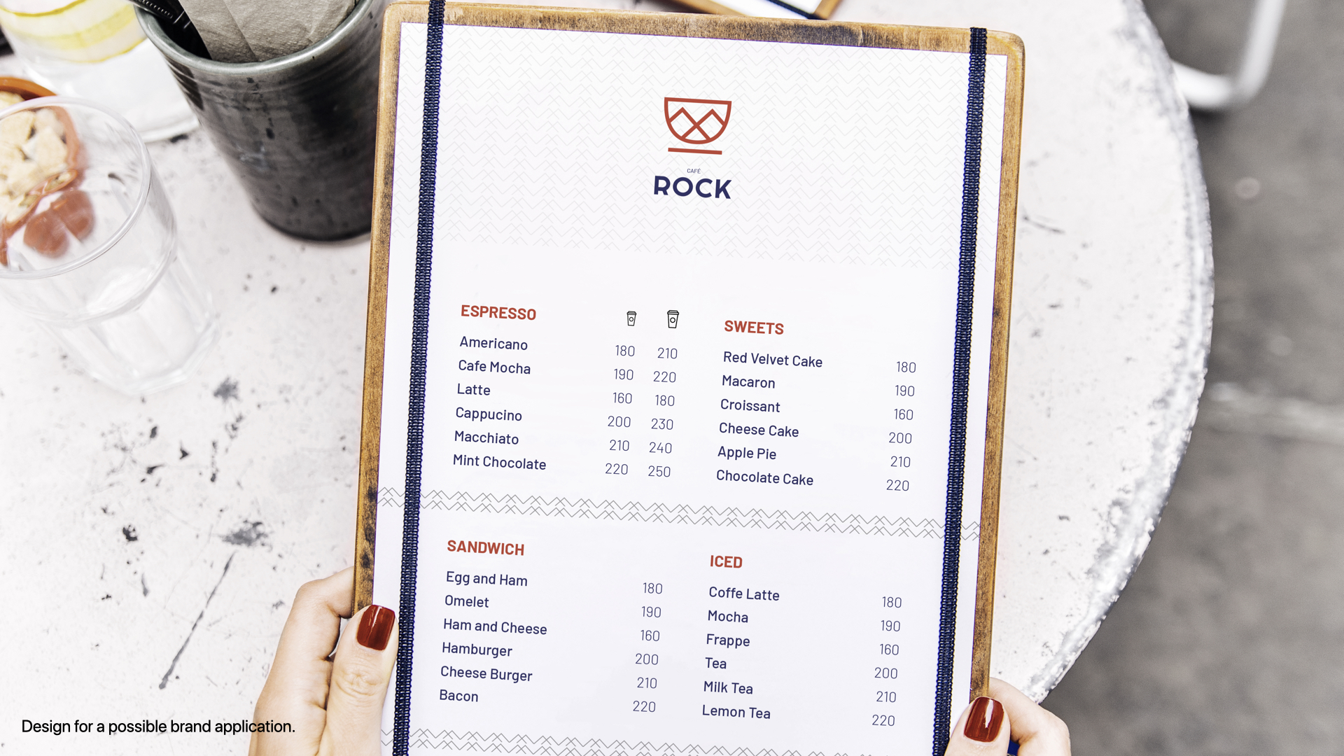
6. Possible Applications
It always help drive the project home with mock-ups of logo and brand application. Not only does it help the client see everything in action. It also helps me as the designer see the application for what it is instead of imagining.
7. Closure
I was quite confident about this option so I did the unimaginable – I pitched just this one option. And the client (and his father) loved it.
With zero follow-up changes, we wrapped the project to satisfaction.